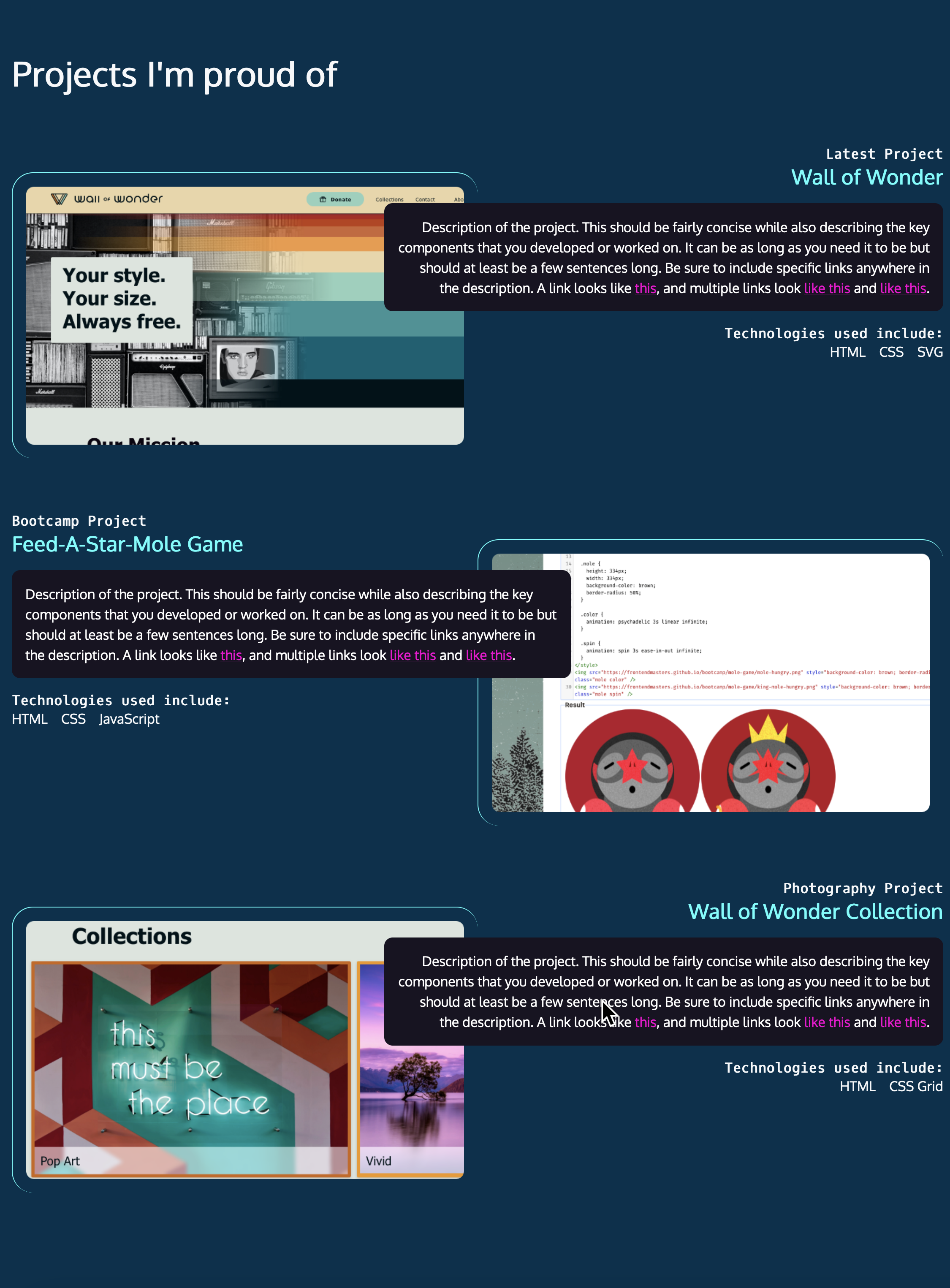
Chapter 5: Project section
The home page for the website is done except for the project section... and this one is a doozy! Our designer came up with a super cool layout, but it's going to take a bit of work to get it in shape. Fortunately, when you break the problem into small, sequential steps, it is not too bad to put it together.
We'll go back to CodePen to prototype our first project and work out the bugs. Once we know how one project works, the other two will be pretty similar to that.
Part 1: Marking up the HTML
Always start with markup! Start by marking up a single project item for the website. Here's some pointers:
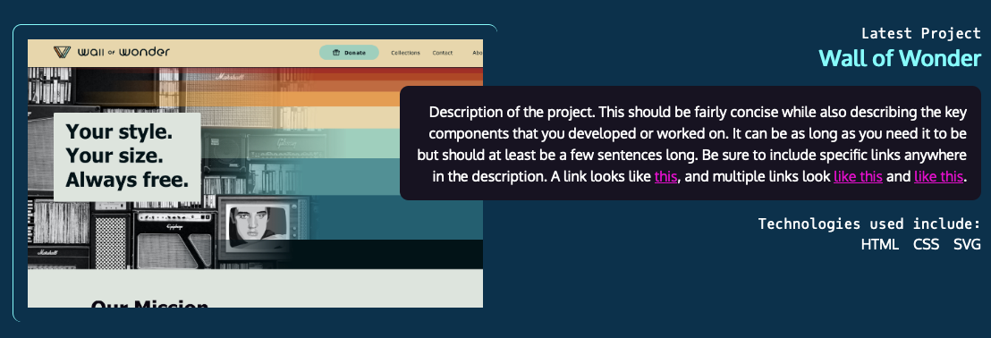
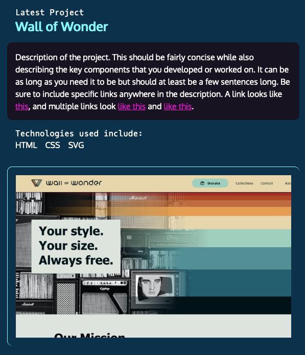
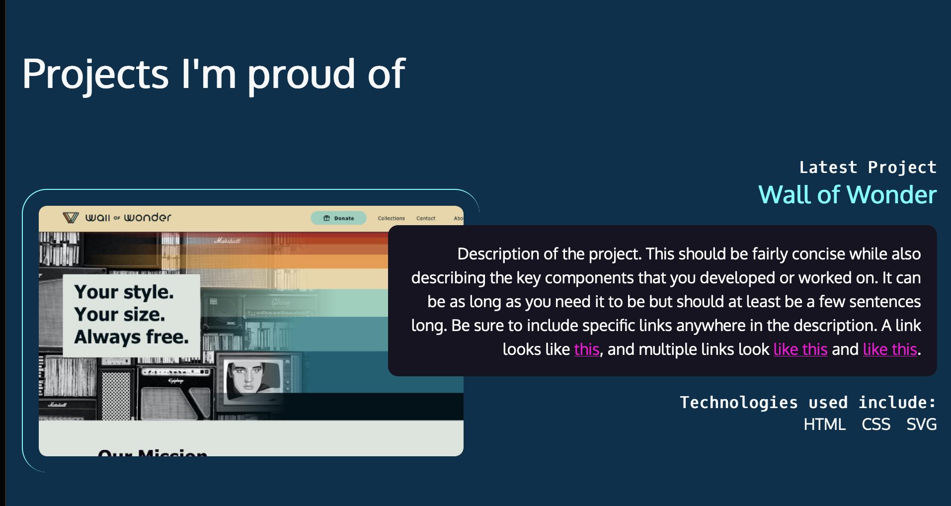
- Not pictured: A headline that says "Projects I'm proud of", this project, then 2 additional projects.
- Consider the portion of the site you just built. Where were H1, H2, and other headings placed? Where are you in the hierarchy of headings? Remember to make the headings reflect the page overall.
- Think about what this project is. Does it stand alone as its own content? What is narrative? What's a list?
Remember the goal of the first pass is to get as much semantic HTML as possible in place. We can add addition non-semantic HTML (div, span) and classes if they're needed later.
Part 2: Styling for mobile
With the markup in place, let's style for mobile dimensions. Do not worry about media queries for now. Style the project as it would appear on a mobile device. We'll add desktop styles with media queries in the next part.
Be sure to think about the background color for the project vs. the current background color.
Part 3: Styling for desktop, side by side configuration
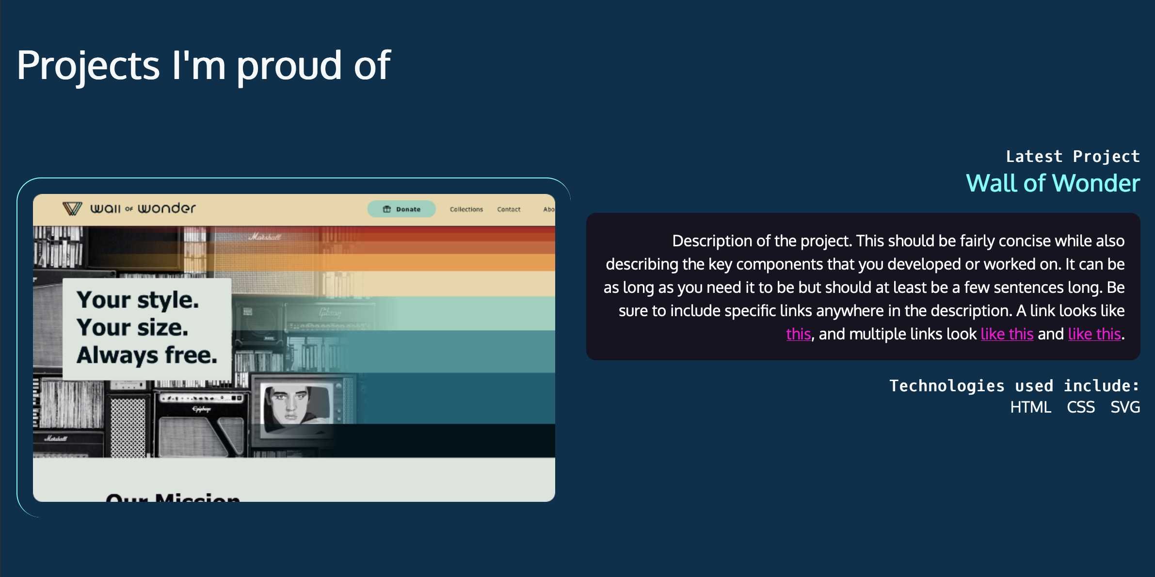
Making the text overlap the photo is a little scary, so let's start with something less scary. How can we place the image on the left and the text on the right? Think about what needs to be grouped, what needs to be restyled at desktop dimensions, and whether we should use Flexbox or Grid - or does it even make a difference?
Part 4: Getting the cells to overlap
Get the text to overlap the image using CSS Grid.
Part 5: You try it: Additional projects
We've added the content for two more projects to the website. Mark up the content, apply styling, and get the section completed for desktop and mobile.
BONUS: The second project should have a reversed layout.
MAKE IT EASIER: All three projects have the image on the left with the text on the right, with the text overlapping the image.